Creating a widget on the dashboard
Learning objectives
- Master the creation of widgets in Quable PIM
- Apply practical use cases and scenarios
Introduction to using widgets in Quable PIM
Now that you are familiar with using completeness indicators and tags to control data quality, it is time to leverage these tools to better track and enrich your product information.
Widgets, displayed on the dashboard of the homepage, are graphical elements or product lists that provide an instant overview of the status of your data. They highlight custom indicators and allow you to quickly access product sheets that need priority enrichment.
In this course:
- You will learn how to create your own widgets to meet your specific needs.
- You will discover practical examples based on different usage scenarios.
With widgets, you will optimize data tracking and facilitate your daily management in Quable PIM.
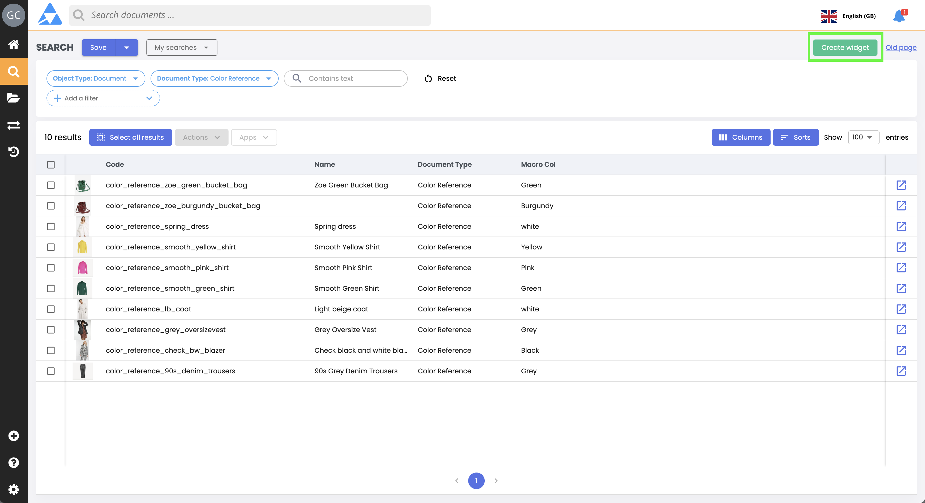
1. Perform a search
Each widget relies on a defined data set created during its setup. Note: once the widget is created, you can no longer modify this set. Therefore, make sure to properly identify the data you want to highlight on your dashboard.
ImportantWidgets must always focus on product sheets. Other object categories cannot generate widgets.
From the Advanced search page, perform a search to select the items to include in your widget.
Forgot the procedure? Refer to our course: Searching and Finding Product Sheets, Variants, or Asset Files.
- Select the object type product sheets.
- Define the document type that will serve as the basis for your widget.
Good to know
- If no filter is applied, all product sheets of the selected document type will be included in the widget.
- You do not need to check boxes to select specific items: the results displayed by the Advanced search are automatically included in the widget.
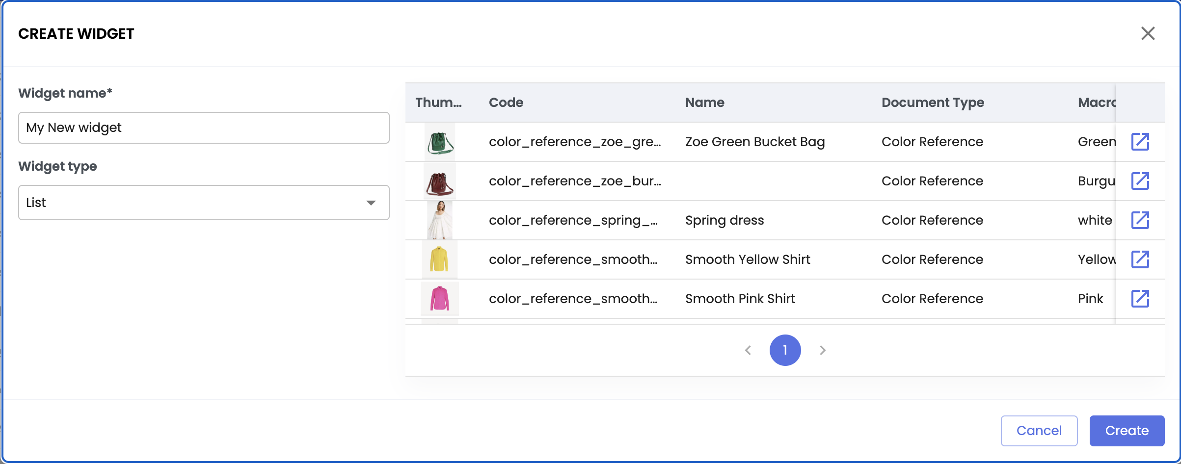
2. Create a widget
- Click the green button at the top right: create a widget.
- Enter the widget name,
- Choose the widget type: list or graph.
a. List widget
List widget types are particularly useful for tracking the progress of workflows or the status of product sheets. The list widget displays on the dashboard the list of product sheets from the advanced search you performed.
These widgets do not require additional configuration. Click Create, and the list widget will be created on your dashboard.
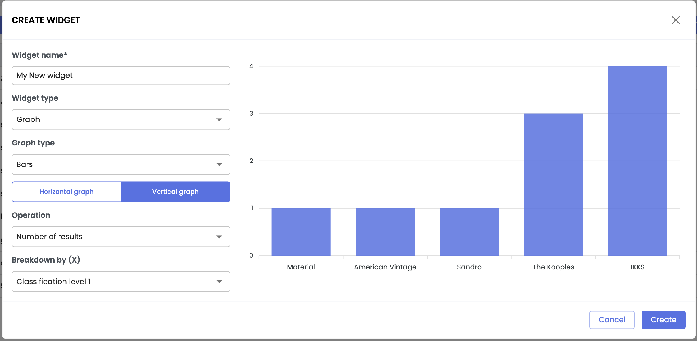
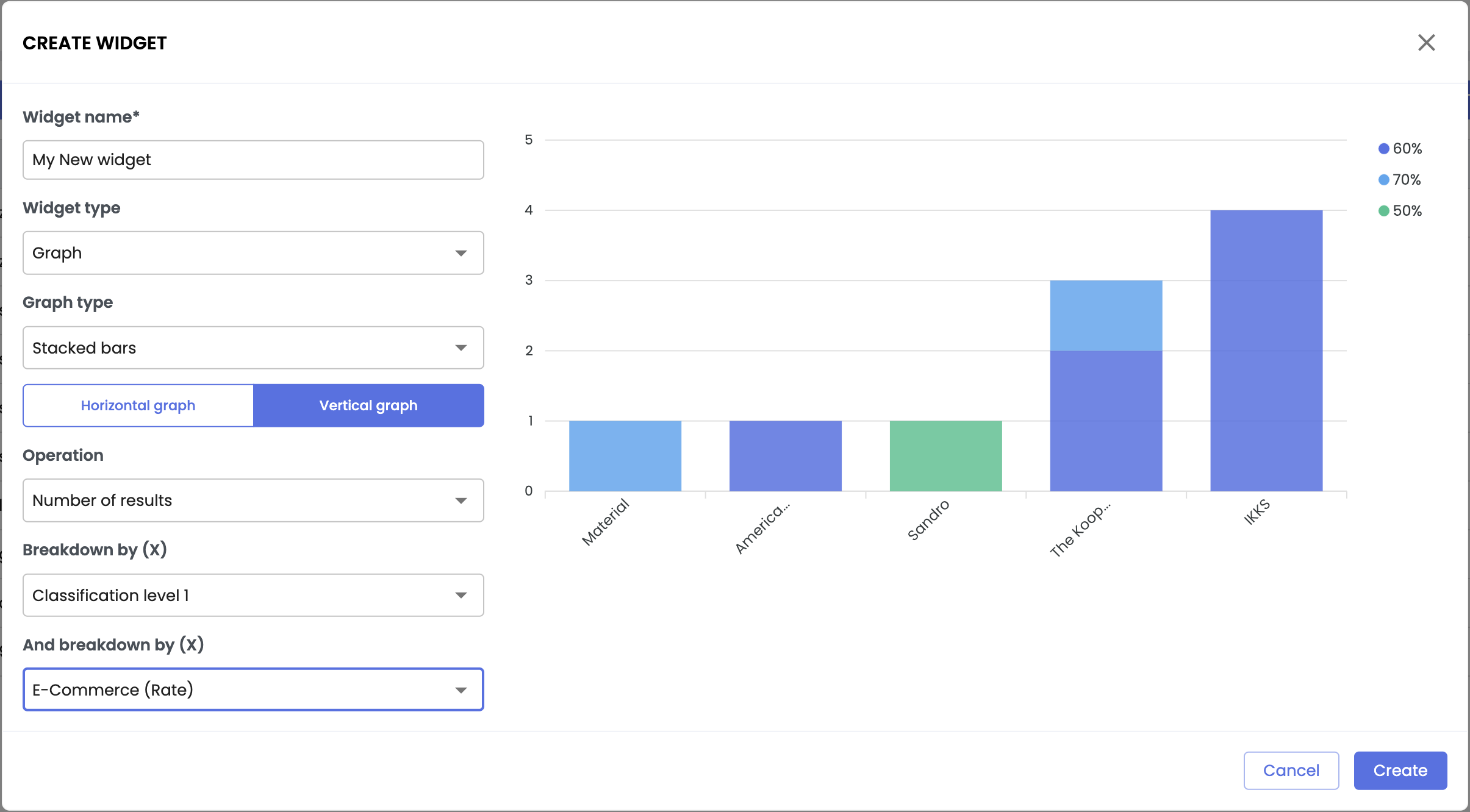
b. Graph widget
Graph widgets are ideal for visually representing large volumes of data, highlighting value distributions. They allow you to quickly understand the state of your data and identify key trends.
When setting up a graph widget, several options are available to you:
- Graph type - choose the representation best suited to your needs:
- Bars
- Stacked bars
- Lines
- Pie charts
- Graph orientation (for bar and stacked bar graphs only):
- Horizontal graph
- Vertical graph
- Operation - define the calculation applied to the data:
- Number of results
- Average
- Sum
- Distributed by - specify the data that the graph should display. You can distribute your results by:
- Classifications,
- Completeness indicators (by percentage or by complete/incomplete status)
- Tags,
- Workflows,
- Attributes (by attribute value)
- And broken down by - (for stacked bars only): add a second level of analysis to break down the graph's data by:
- Classifications, completeness indicators, tags, etc.
- Classifications, completeness indicators, tags, etc.
Once your settings are configured, click the Create button. Your graph widget will then be added to the dashboard.
Best practiceFeel free to test different types of charts to familiarize yourself with their appearance.
Experiment with different configurations to identify those that best fit your needs and analytical approach.
3. Practical case: create useful and relevant widgets
The practical cases below illustrate concrete examples of using widgets to make the most of your data. Use these scenarios as inspiration to create widgets suited to your business needs.
a. Widget based on a completeness indicator
Track the progress of product sheet enrichment with a widget based on a completeness indicator.
Example: tracking logistics enrichment
You are responsible for e-commerce data, and a "E-Commerce" completeness indicator has been defined to monitor the enrichment of e-commerce attributes and links. A widget based on this indicator allows you to:
- Instantly identify product sheets that are still incomplete,
- Open the product sheets to enrich the missing data,
- Track the completeness rates in your logistics scope directly from the dashboard.
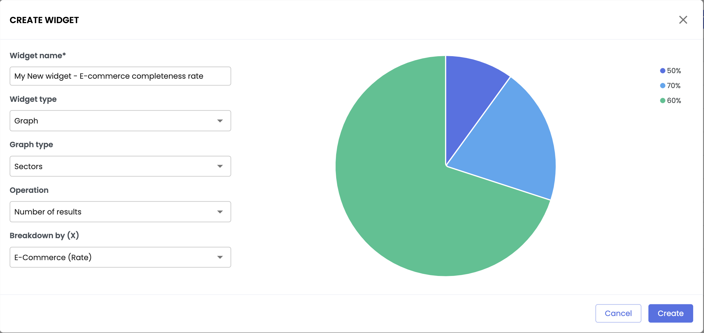
Good to know
- When creating the widget, filter in the widget creation window by the desired completeness indicator,
- Choose the completeness indicator by:
- Rate - exact percentage value of completeness.
- State - complete sheets (=100%) or incomplete (<100%).
b. Widget based on a tag
Widgets based on tags are particularly useful for monitoring specific statuses or alerts related to your product sheets.
Example: tracking product sheets not ready for marketplaces
You are responsible for marketplace data, and a "MktPlc Not Ready" tag has been configured to signal product sheets that do not meet the necessary requirements (missing attributes or links). By creating a list widget based on this tag, you can:
- Immediately identify, from your dashboard, the product sheets that need action.
- Access the product sheets to enrich the missing data,
- Organize your priorities to make these sheets compliant and ready to be published on marketplaces.
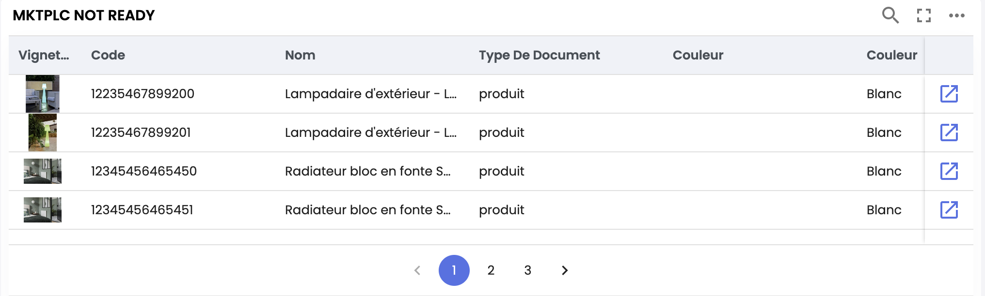
Good to know
- To configure a widget based on a specific tag, filter by this tag in the Advanced search.
- You cannot filter by a specific tag in the widget creation window.
c. Widget based on a workflow
Widgets based on workflows are ideal for visualizing the progress of product sheets in your business processes.
Example: managing the product sheet workflow
You are responsible for distributing product sheets across different channels. A workflow has been set up to track the enrichment steps, based on contributions from various teams. By creating a graph widget based on the workflow, you can:
- Get a view of the stages where your product sheets are in the process.
- Identify stages where slowdowns or bottlenecks are occurring.
- Access the product sheets that have reached the last step or identify those blocked at an intermediate stage of the workflow
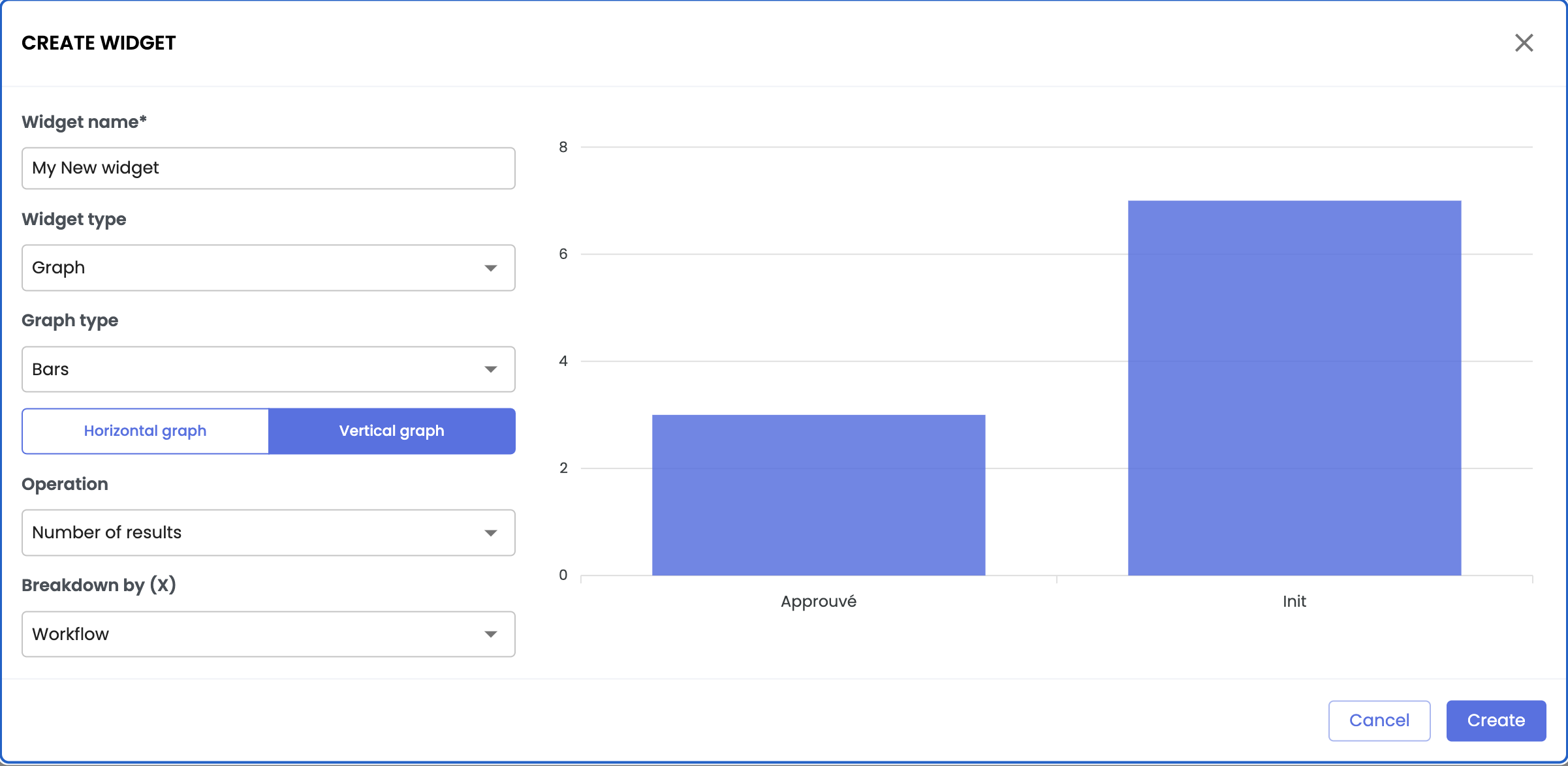
Good to know
- To configure a widget based on a specific workflow step, filter by that step in the Advanced search.
- The widget creation window does not allow you to filter directly by a specific workflow step.
d. Widget based on classifications
Widgets that use classifications, broken down by a completeness indicator or tag, are particularly useful for tracking the progress of data enrichment across different product categories.
Example: tracking enrichment by classification
As a product manager, you manage a specific portfolio of categories and need to track their progress in terms of enrichment. Thanks to classifications that structure your products into organized folders, a widget based on these classifications and broken down by a completeness indicator allows you to:
- Quickly identify the product sheets in your portfolio,
- Access directly the sheets still incomplete to enrich the missing data,
- Visualize the evolution of the completeness indicators of your categories, directly from the dashboard.
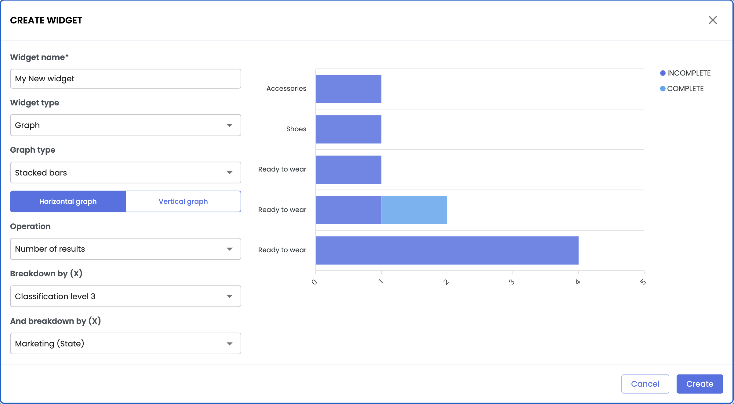
Good to know
- A well-structured hierarchy makes it easier to organize product sheets in the PIM and improves the relevance of widgets created from these classifications.
- To display two dimensions simultaneously (in our example, classifications and completeness), use stacked bar graph widgets.
In summary
- Widgets: They provide an instant and customized view of product data from the Quable PIM dashboard.
- Widget creation: Based on advanced searches, they define a dynamic set of product data.
- Types of widgets:
- List
- Graphs
- Usage: They allow for quick and efficient management of product sheets through direct actions from the dashboard.
- Practical cases: Deploy custom widgets based on your business needs, using completeness indicators, tags, workflows, classifications, or attributes.
Next Chapter
Now that you know how to create a widget on the dashboard, let’s explore how to Use and manage widgets from the dashboard.
Updated 10 months ago