Branding
The Branding page allows you to define and manage your Quable Portal name and design.

The page includes three sections:
Once you have made all of your selections, click the Save button to save your changes or the Back button (in the top navigation) to return to your previous location without saving the branding selections.
Portal Name
Enter a name for your Quable Portal in the Portal Name text area.

User Interface Graphic Models
Choose the user interface that best suits your needs and meets your users' expectations.
Choosing the Graphic Model
The dropdown list titled Design template allows you to choose between two options:
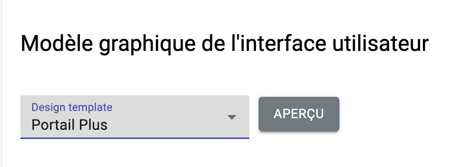
- Standard Portal: Standard graphical interface of the portal
- Plus Portal: Premium graphical interface of the portal
The Preview button allows you to see a screenshot and a description of the interface before confirming the change.
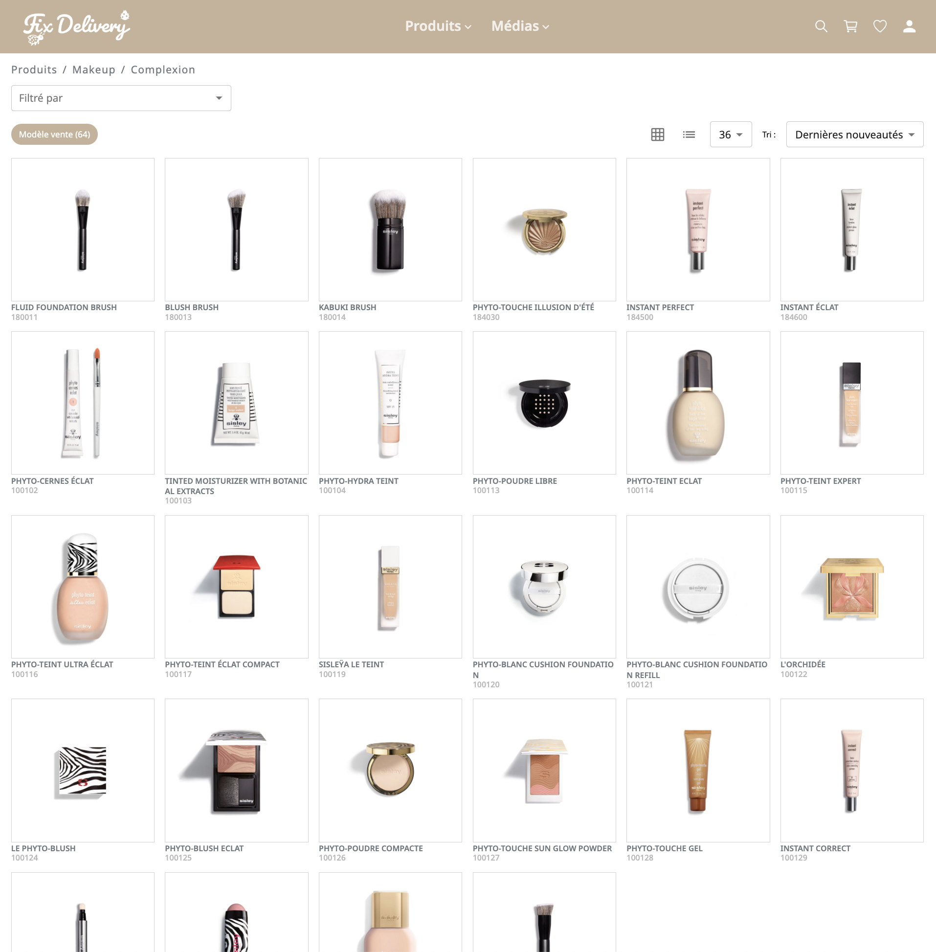
"Portal Basic" Graphic Model
This template offers a standard user interface. Featuring an efficiency-focused design, this interface is designed to facilitate navigation, search, and consultation of product sheets and portal media. It meets the standard needs of the majority of users.
"Portal Plus" Graphic Model
This template offers a more responsive and modern user interface. Featuring a clean and premium design, the interface is spacious and elegant.
Although the overall structure of this template is identical to that of the "Basic Portal" template, the "Portal Plus" graphic model brings UX improvements on the following pages:
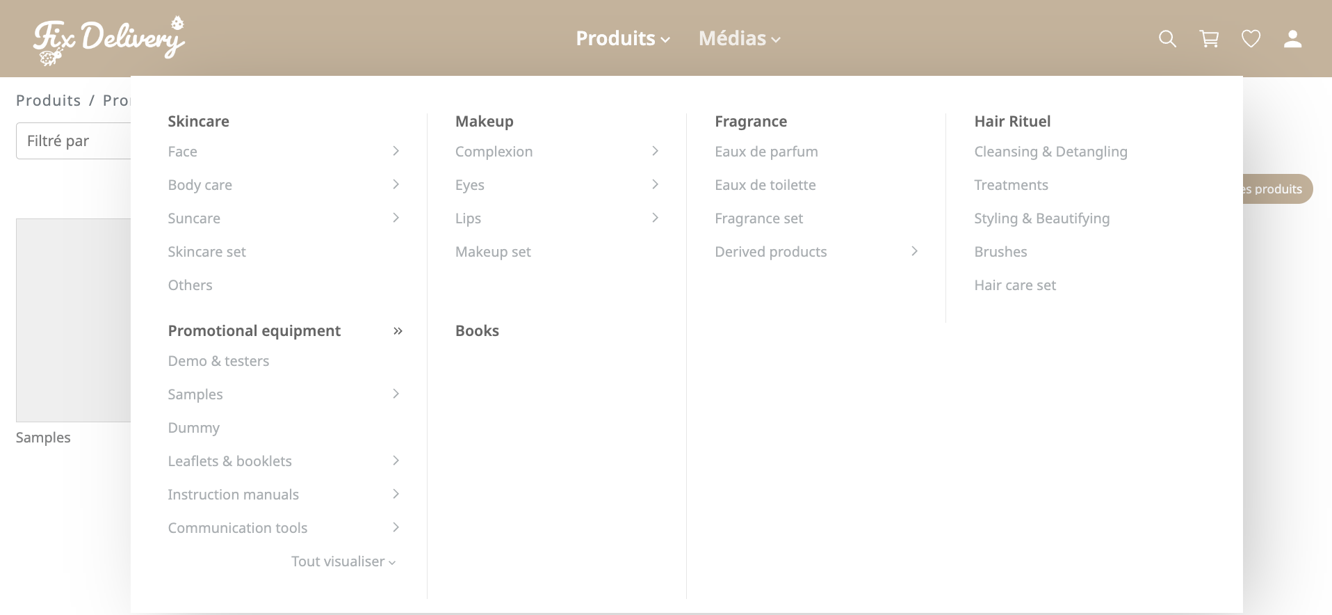
Navigation Bar
The navigation bar is fixed and always visible. Classifications are accessible via a dynamic menu. The navigation retains the same menus and classification structure but with a modernized design.
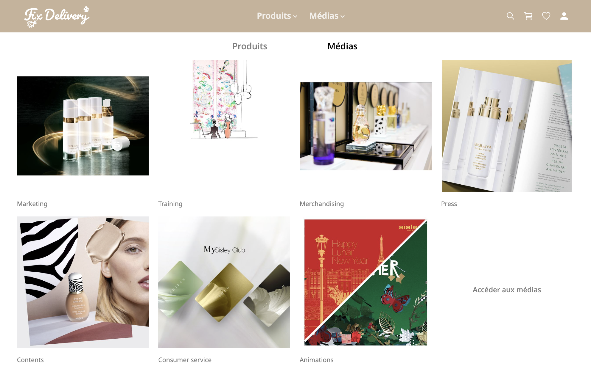
Homepage
The main products and media are accessible through two prominent tabs. The layout emphasizes visuals.
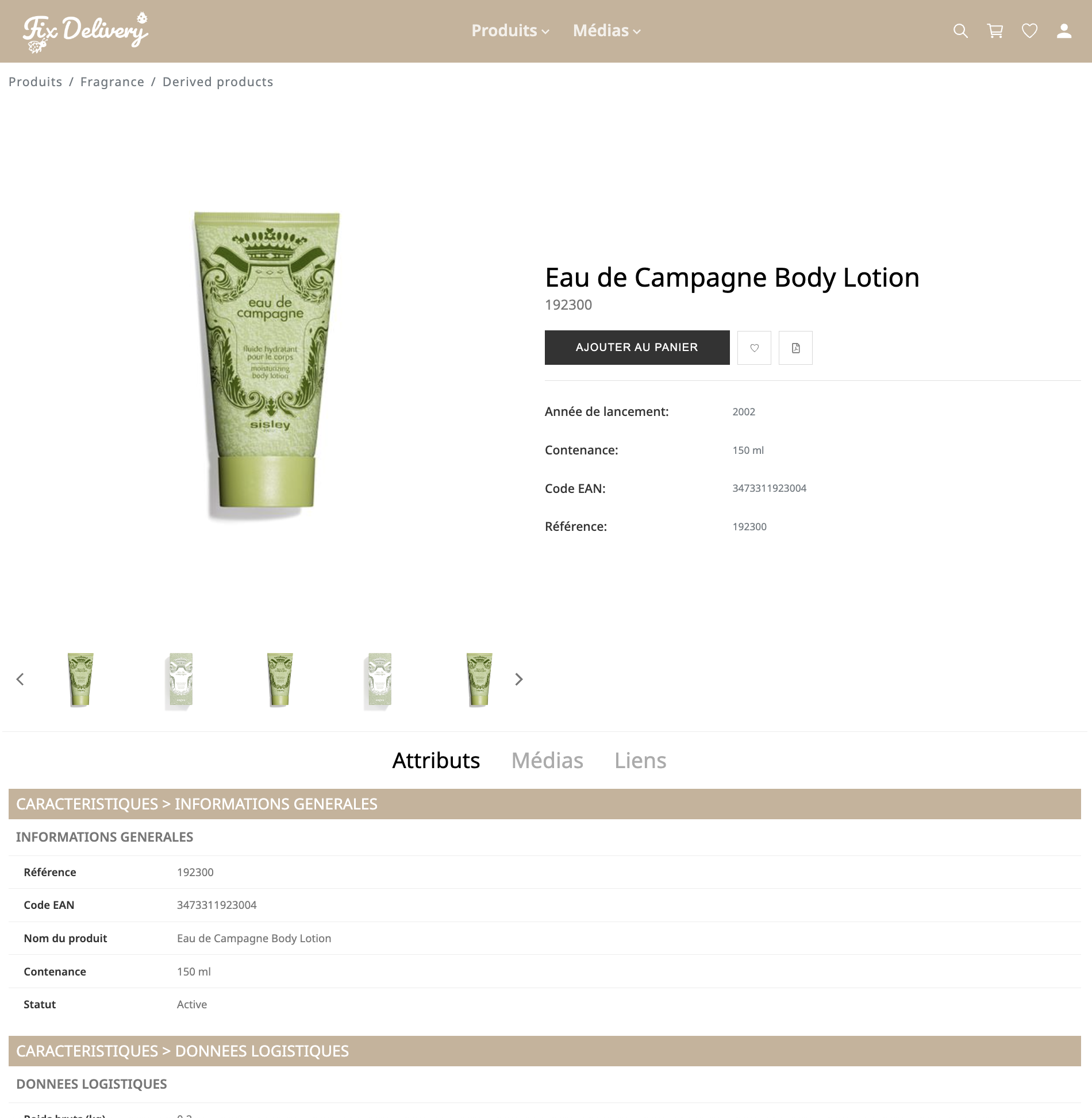
Product Details Page
The layout highlights visuals and offers smooth and spacious navigation. Access to Attributes, Media, Links, and Variants is provided through a series of tabs. The dynamic breadcrumb shows the current position in the classification, making it easier to navigate back.
Product and Media List Page
The layout places more emphasis on visuals. The organization of the page's structural elements optimizes navigation and readability. The dynamic breadcrumb shows the current position in the classification, making it easier to navigate back.
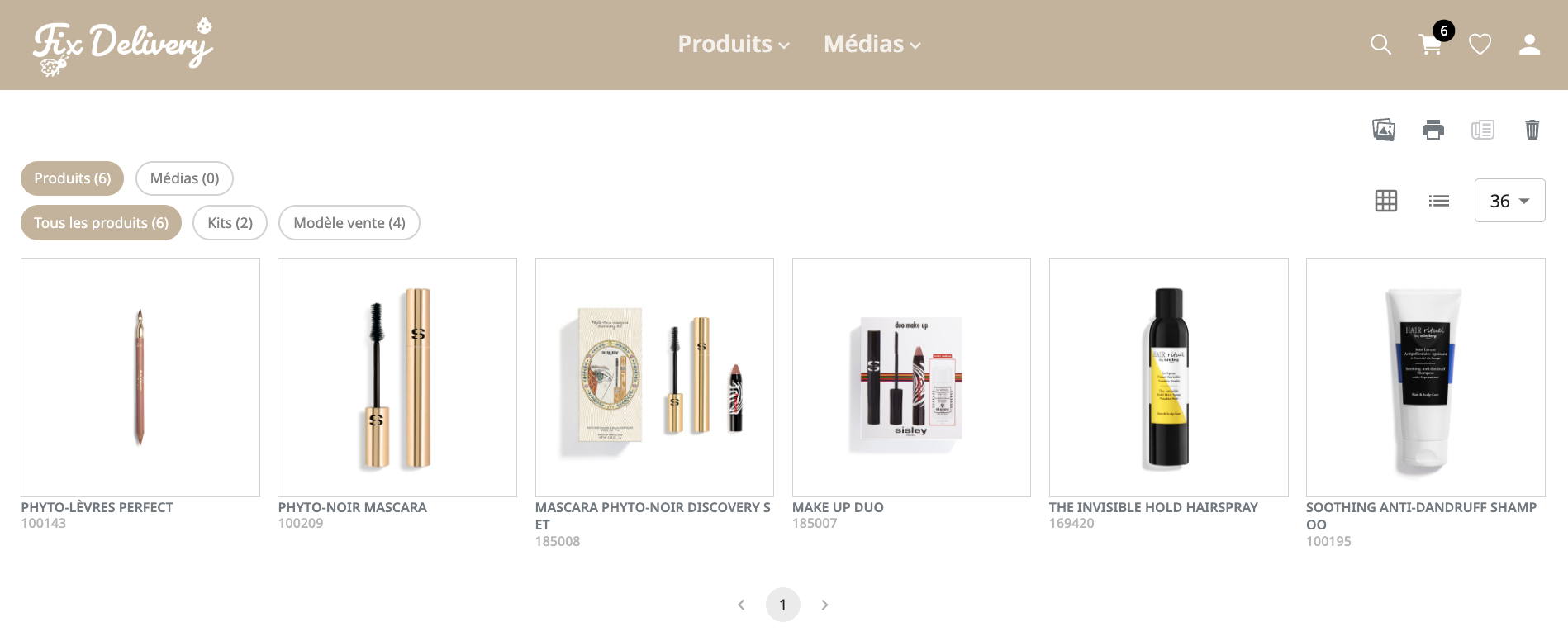
Cart and Favorites Page
The action buttons on the cart page are reorganized to optimize the retrieval and sharing of items in the cart. The coherence of the cart and favorites pages is optimized.
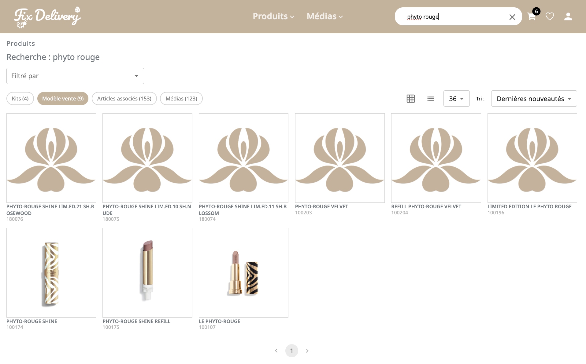
Search and Results Page
The search experience optimizes readability and navigation to results.
Images
This section allows you to define all of the images to configure your Quable Portal with your own branding.

To add an image, click on the Upload icon next to the preview image. This opens the following dialog:

Click the Upload button to browse for an image, then click the Save button to save the image or the Cancel button to abort the addition of an image.
NoteBe sure to click the Save button when uploading an image!
Logo
The logo to display in the upper left of the portal.

Logo (login page)
The logo to display on the portal login page.

Empty image placeholder
The image to use if a product sheet does not have an associated asset.
Background (login page)
The image to display in the background of the portal login page.

Favicon
The image on the tab of the web browser page (typically 16 x 16 pixels).

Colors & Font
This section allows you to specify the typeset to use for text as well as the colors for various interface elements in your Quable Portal.

For each color option, you can click on the colored square to access the color picker.

The color picker allows you to select a color by clicking on the large area. You can also use the slide bar beneath it to select another color in the same tone.
If you know the code for the color you want to use, you can enter it directly in the text area. The arrows enable you to switch between HEX, RGBA, or HSLA.
Font family
You can choose any of the following fonts. Noto Sans is selected by default.

Font color
The colors for the font in the Menu, Button, Title, and general Text can be modified to suit your preferences.

Background color
You can select the colors that correspond to your graphic charter for the Menu, Button, and the portal's Top menu.

Icon color
You can select the colors of the icons for your Call-To-Action (CTA) and top menu buttons, as well as the badge for the cart.

Color SettingsColor settings (font, icons, and background) may vary depending on the selected graphic model.
Make sure to choose your graphic model first, then configure the colors afterward.
Save Settings
ImportantTo apply your custom settings for name, template choice, font, and color, click the save button at the bottom of the page.
Updated 10 months ago